Alexandra is a passionate freelancer sports coach, and has the merit of having created her Wordpress site on her own. During a move, it was necessary to review its SEO strategy and it was the opportunity to get a good paint job on its site. I suggested that she switch to my in-house framework and review her logo and graphic charter.
She was talking about a quiet, relaxing place, about Yoga, wide open spaces and healthy sport in the nature.
I saw something light, refined, but not aggressive, I chose grey texts and grey flat logos over a light grey background.
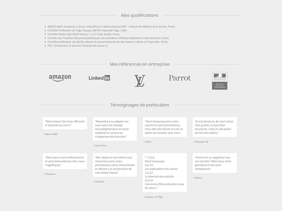
Based on the format of her business cards, I designed a dark grey squared title with massive (weight 800) and thin (weight 200) Raleway characters in pure HTML / CSS:
See the Pen Alexandra Lepoix - title logo by Alexis Riche (@alexisr) on CodePen.
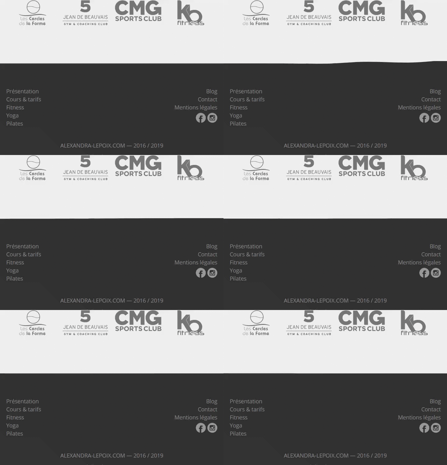
I added a jQuery wobble effect on the footer, which reminds us either of the kilos to lose or of the contraction of muscles during exercise:
People using Chrome will enjoy a smooth reflection under the title catchphrase:

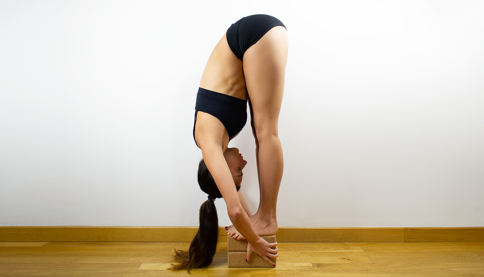
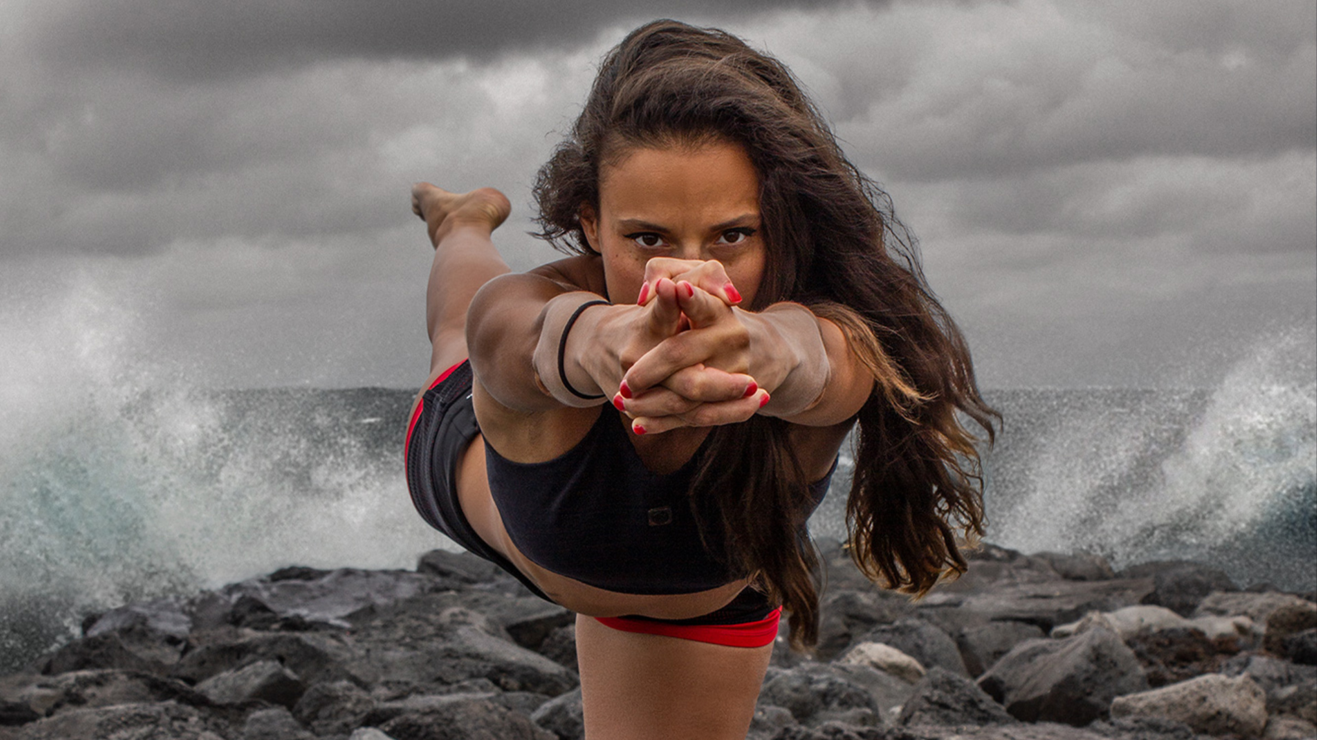
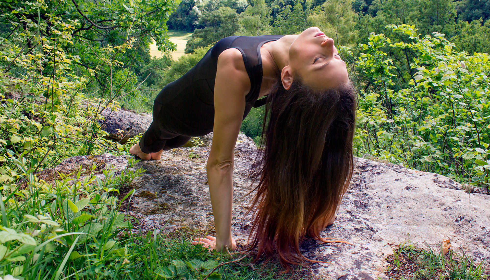
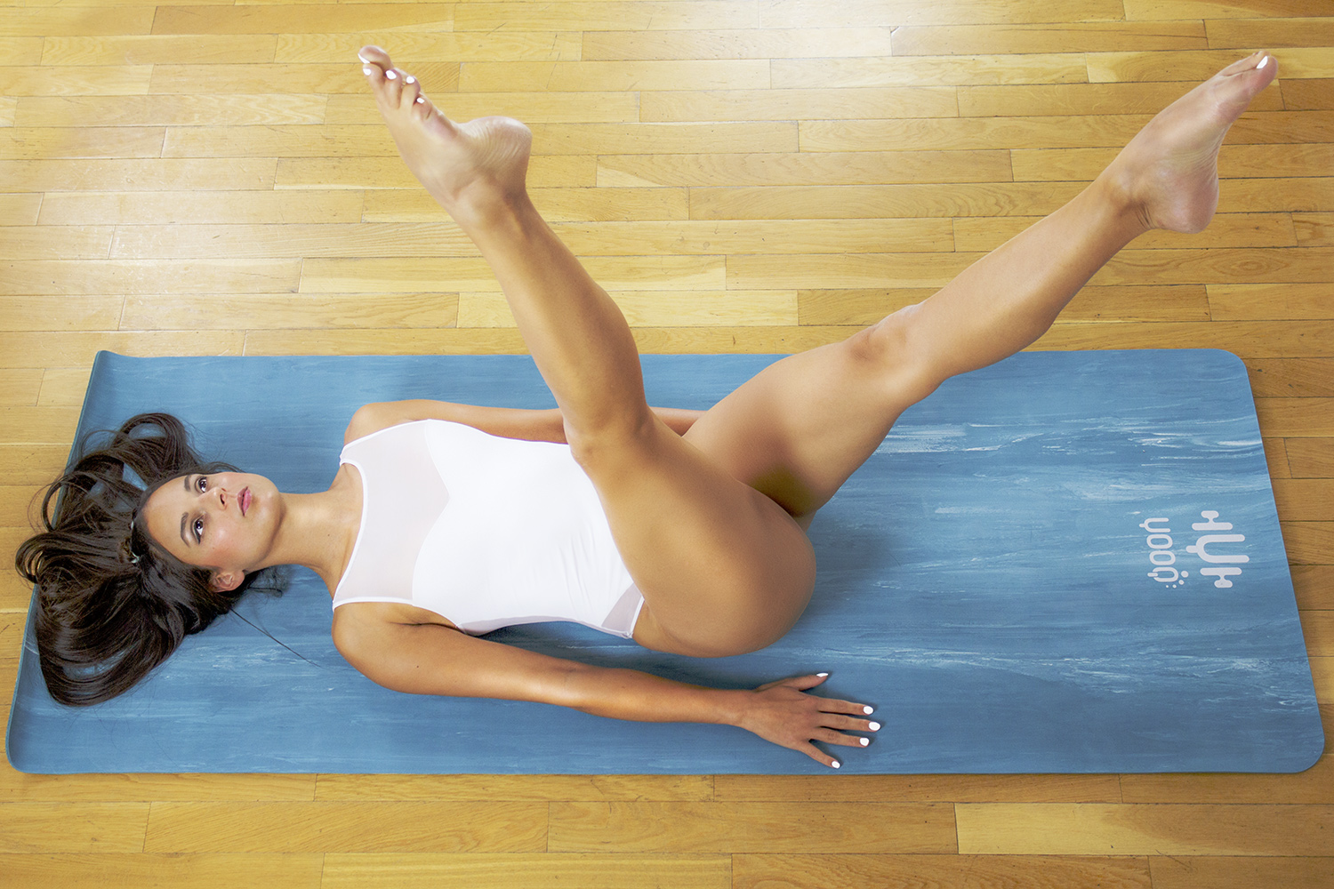
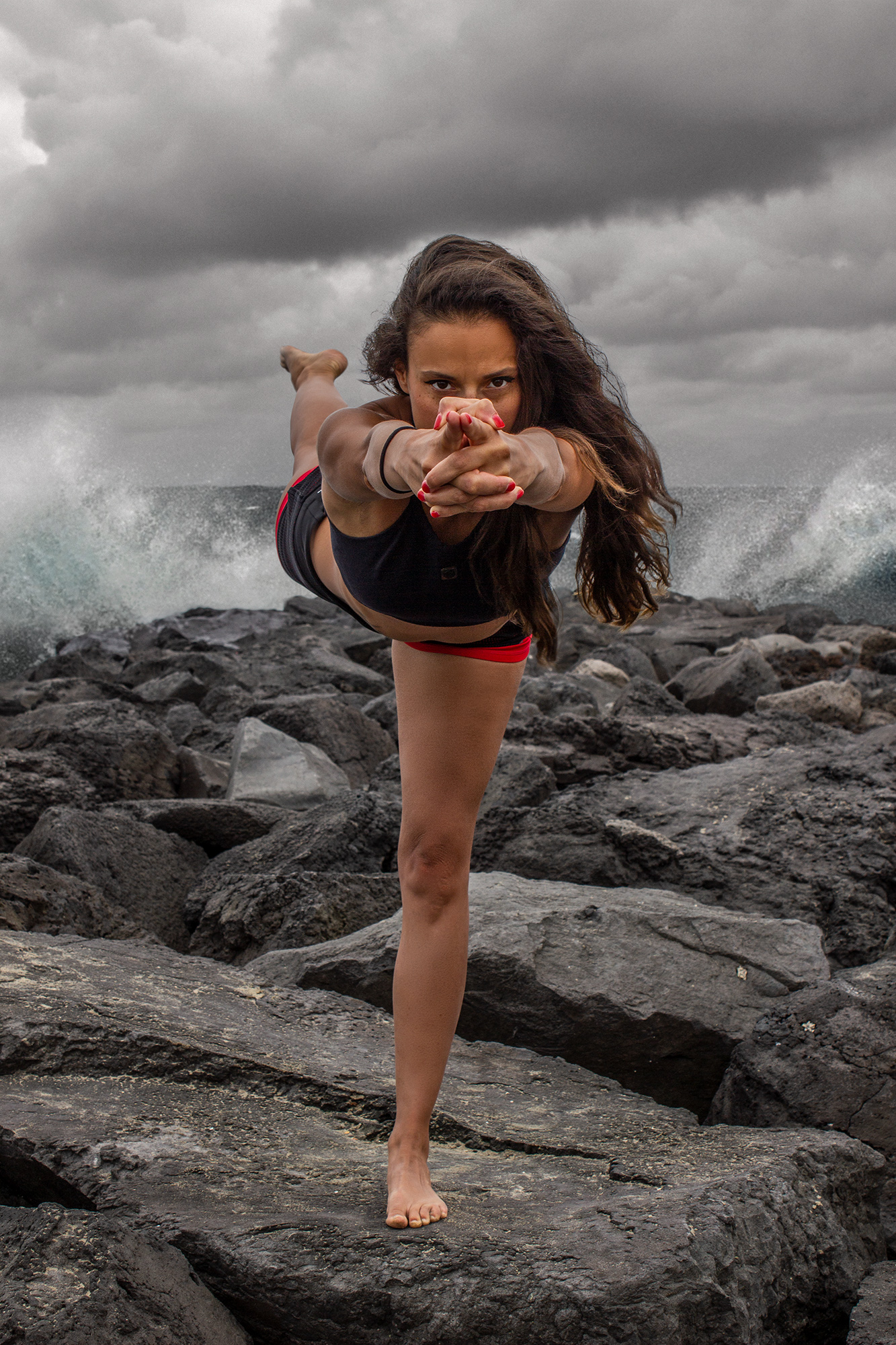
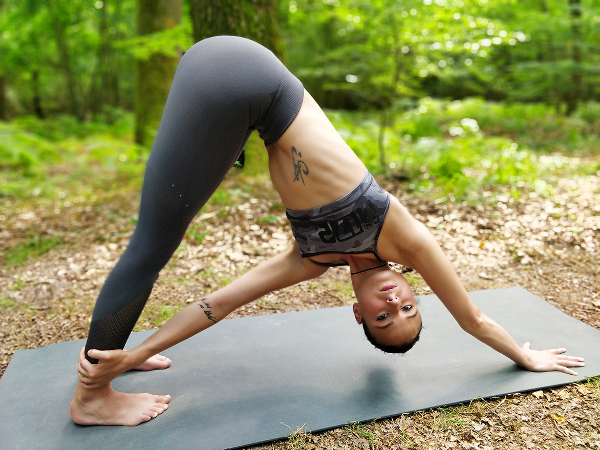
I was also in charge of creating her new visuals, as a photographer:
