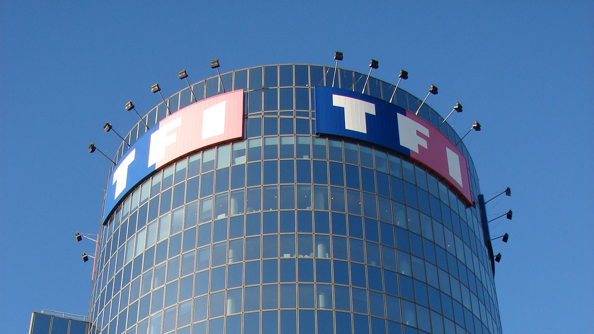
At the very beginning of my career as a graphic designer, I was entrusted with designing a promotional poster for the broadcast of the series Heroes, commissioned by TF1, to cover the facade of its tower in Boulogne-Billancourt.
An abrupt, headfirst introduction to an exciting profession — though not without stress — which I was to discover hour after hour, watching my email inbox, waiting for the graphic assets needed to build the poster, which eventually arrived by courier.
Not a minute to waste during the composition: efficiency had to take precedence over originality, while staying in sync with the printing teams to make sure I could send them the final file in the right format.
"Ready for Apple–P" (⌘P), they told me on the phone — me, a complete newcomer without the slightest knowledge of anything Apple.
Panic overcome, this first commission was a success, and I still remember my pride at seeing a creation of mine printed on 300m² for the first time, in full view of the traffic on the Paris ring road.


A complete break from my usual A4s
Although it was genuinely thrilling to work on such spectacular posters, creativity was nonetheless heavily constrained by the requirements of the advertiser and its partners.
It had to be classic fare: visual, tagline, partner logos.
I was nevertheless given carte blanche for the 2010 FIFA World Cup.
Considering the event received enough media coverage not to burden it with taglines, I pictured a giant ball suspended in front of the facade.
If it was going to get people talking anyway, why not a trompe-l'œil of a ball bursting through the tower's glass facade, revealing a football pitch lawn on the inside.


On the massive psb file of 18106 × 12687 pixels (1.6 GB), the matte painting of the glass effect took hours to render.
The reception was broadly positive, despite some concerns that it might encourage vandalism — concerns that didn't put an end to this design idea.
However, things are never quite that simple, and the campaign ran into a few setbacks:
- A requirement that the event dates and the partner logos be displayed;
- The ball visual had to be replaced for rights reasons;
- Deadlines were too tight to print on transparent film, which was replaced with micro-perforated vinyl and a background in the most discreet gray / blue possible.
Lacking photos of the actual campaign, here is the mockup of the final visual used for it:

Really Beautiful
Répondre